
10 designtips for beginners
Would you like to start designing your own print work, but don't know how? This might keep you from actually starting, which would be a shame. We have a few simple tips for you to get you started!
Start with a free program
Is the design that you have to make not commissioned by someone? Then you also don't need an expensive design program (yet). Practice first with a free program such as Canva. You can also transfer to a paid program later on, but if it turns out designing is not for you, you haven't wasted money on an expensive program.
See also: Free design programs
Keep it simple
Keep your design as simple as possible and be aware that you don't have to make a masterpiece right away. As a beginner, difficult functions that you don't understand can be very frustrating. Save yourself the effort to want to try this immediately, and learn the basics first. Only add elements that have a reason to be in the design, but keep the number of elements to a limit.
Pay attention to the size
Consider where you are using the design before you start. Are you making something for Instagram? Or for a website? Make sure you choose the right size from the start based on the situation in which you will use the flyer: a design for a marketing poster has to be much larger than for a flyer.
It would be a waste if the quality of your design is reduced because the size was not right from the beginning. Many programs offer a variety of templates, so it is only a matter of looking for the one you need.
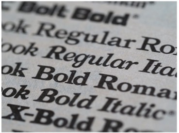
Font
There are many different fonts you can choose from, so we get that you want to use multiple in your design. However, to keep your design as clear as possible, it is important to not use more than 2 or 3 fonts. Otherwise, your work might look chaotic and unprofessional. The size of the font says a lot about how important a sentence is. Always make the most important text on your flyer the largest, so it immediately stands out to the reader.
Balance and symmetry
Balance is key for an attractive design. This doesn't mean that everything has to be the same size or perfectly aligned, but do make sure there is enough space between your elements. To achieve this, you can use a grid. By using a grid, you can check that there is an equal amount of space between the different elements. Margins are also important for a design: the rule is often that there has to be a 2 cm margin on all sides. This leads to a clearer flyer and reduces the chance of text or elements being cut off during the production of the prints.
Consistency
Make sure your design is consistent. This includes always using the same font size for titles, subtext, and body copy. Additionally, the colors used should match and be used in multiple places throughout the design. This also includes the colors of any photos and images that are used in the print.
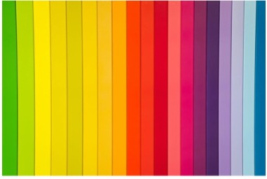
Use a color palette
As a designer, it is important to know how you can make a statement by using the right colors. It is important that the colors used match the subject of the design. The right colors will attract attention and increase the impact of the design. It is recommended to use a color palette with 1-3 primary colors (colors that are not used by mixing - red, green, and blue), and 1-3 secondary colors (a combination of two primary colors).
Keep the target in mind
Who is the audience of the design, and what do you want to achieve with it? Try to view your design through the eyes of someone else and consider if the goal and subject of your design are clear enough. For example, you can ask yourself: What is the first thing someone looks at with this design? If the answer to this question is what you intended, you are on the right track! If it turns out your attention is drawn to something else, you have to make some changes to your design.
Ask for feedback
As a beginner, it can be scary to ask for feedback. However, especially in this phase, it is important to do exactly that! You might be overlooking something that someone else does notice. Negative feedback is not always nice to hear, but you can learn a lot from it!
File type
Is your file ready to be exported? Make sure you know to which file type you have to export it, as this is important for the final quality of your work. When do you use which file type?
· PNG: Images with a transparent background (Logo’s)
· JPEG: Photos or a design for a website
· PDF: Printing or sharing files without changing the layout or quality
· EPS: For logos and illustrations. You can enlarge these without reducing the quality, so this is a useful file type for prints of a large size
Check our submission conditions